Tuesday, May 29, 2018

Dining room: rug, chandelier, curtains and table

Getting a rug for the dining room was a turning point for this room's design.  The rug really pulls the room together and makes it look finished.

I have long wanted a rug in the dining room, but that seemed ridiculous when my children were younger.  My kids are a bit older now (8 to 12), and we still get a decent amount of food on the rug.  However, I love having it, despite the not-negligible amount of work it entails.


I purchased it on ebay. I deliberately looked for a 10x16 rug that was not in great shape, since I expect it will get lots of wear and food on it.  Low pile, uneven wear and abrash were fine with me--I wanted something super cheap.  I also knew that whatever I bought would probably also need to be cleaned (in the NYC area expect to spend around $200-$500 for a cleaning, depending on the size of the rug), so that would add to the overall price of the rug.

*******

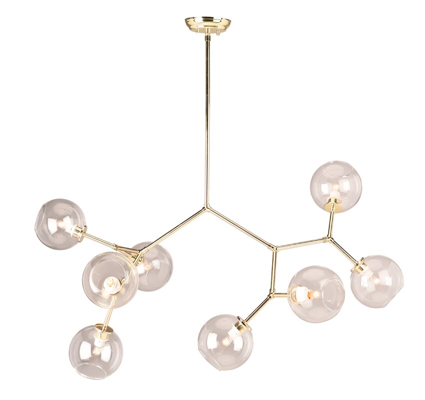
The original chandelier was not centered in the room, presumably because the original room would have been the living room.  However, it was hung towards the end of the room, which is weird--it wasn't even centered over the former owner's table. 


When we bought a new chandelier I had the electrician move the chandelier to the center of the table.


The windows got a pelmet and some greek trim curtains.  This is the same window treatment as in the parlor: a pelmet kit with Ikea Ritva curtains and some greek key trim.  Since this is the only window in the house that doesn't have furniture in front of it, it was my only opportunity to use drapes.  Hemming those curtains evenly was a wee bit beyond my skill set and took a few days.  My sister drove two hours to my house to help me thread the sewing machine. (Thanks sister!)


*******

Last but not least, the table and chairs. I am sporadically and half-heartedly looking for another, larger table. This one comfortably seats 10, but I would like one that seats 12 or more.  Unfortunately large tables are crazy expensive.   I also haven't really decided what style of table I want, so this may take a while.

Alternatively, we could have this table refinished.  One end of the table is in okay shape, the other end of the table has a significant "patina" of wear. 


And by "patina" I mean "looks like we stab the table with cutlery and iron our clothes on it." 


Those white spots are hot French toast served on paper plates while I was not at home. 

Of greater urgency is the chair situation.  We have seven chairs at a table for ten.  I accidentally spilled white paint on one of the chairs, which did not improve its appearance.  I am actively searching for either a set of 10 matching chairs, or a set of 8 matching chairs and a separate pair of captains chairs for the head and foot of the table. 

Monday, May 21, 2018

Dining room: the buffet wall and Bessie the cow

The back wall of the dining room has gone through a number of iterations since we moved in.

I started with a campaign dresser from Pottery Barn Kids.


If it had been twice the size I think I probably would have liked it, but the 56 inch piece was just too small on that wall.  The white dresser with the white Ikea bookshelves against the dirty cream walls was just....boring. I was also not impressed with the quality of the piece considering how much I paid for it. The interior of the drawers were unfinished wood, and they didn't pull in and out smoothly.  For as much money as I spent on it, I wasn't going to keep it if I wasn't happy with it, so we returned it.

FYI, in the event that you are looking for a white campaign dresser, Home Depot has one for less than half the price.  I cannot speak to the quality, as I've never seen it in person, but that was one of the things that made me return the first piece.

While I was hunting for another piece, I put the Ikea Tarva dresser we already owned there for a while, with some art we found at a thrift store.  The art is a weird lenticular piece, with two sets of eyes that appear to move if viewed from different sides.  This wall can be seen from the street if the drapes are open, so for a while we were the house with the giant lady in the window.


I had some requirements for the buffet piece.  I wanted drawers to hold our junk, so that took out most buffet pieces with doors.  I wanted the piece raised up a bit, as there is a vent in the wall I did not want to block. I wanted it to be at least 75 inches long.

After buying our living room sofa, I had a few hundred dollars worth of reward points and a 20% off coupon to Crate and Barrel, so I ended up buying the CB2 Crawford dresser, which was on back order forever.  They rescheduled delivery four times.  It finally showed up...and it was a bit dark and one drawer won't stay shut.  But it was long and had drawers, so I was hemming and hawing on keeping it.


Since we were having the first floor painted, our painter agreed to paint the just the metal frame for a nominal price.


In another "its too dark" moment, I started with our blue splatter painting on the side wall.  It looked fine, and originally I was looking for a red/white/blue color scheme in this room.


Unfortunately, this led to a big struggle when looking for other art and lamps on the buffet wall.  Nothing looked good or played well with the splatter painting.

I finally settled on putting a large round mirror in on that wall.  I'm happy with the size of the  mirror, but it also turned out to be a bit dark, so I am debating painting it gold.  (It can't be returned.)


In the above picture I tried the tall white lamps that we already owned.  I also tried that blue lamp from Pier 1, which wasn't big enough and arrived damaged.

I bought these red lamps, which ended up in the parlor.  Too much red with the rug.


I bought these supposedly cobalt blue lamps from Wayfair, which although they were a massive 34 inches, weren't the right blue and....eh, just didn't feel right. Too square.  Too many pointy angles in this room.


I loved these turquoise gourd lamps from Wayfair, but turquoise did not go with the navy art, so I just put them in my cart and looked at them every day for months, wondering where I could put them.

An aside--I loved turqoise for a long time--like 2004-2010...and then I hated it for a while.  It was everywhere, I am so sick of the spa look (still am), and eh, I just wanted it to go away. I've been in a red+white+cobalt blue phase for about five years now.  But....turquoise is making a comeback in my heart.  Obviously.  Since I just filled my dining room and a bit of my parlor with it.


One day I had an epiphany.  I will move the navy art to another room, I will buy turquoise art, the lamps will play nicely with the turquoise in the rug, and then the turquoise lamps will go nicely in the room!

Thank heavens I bought these lamps. I really love them--they are so hefty and large, and they are a beautiful pearly finish, and now they are discontinued! They sold out once while I had them in my cart.  When they came back in stock I bought them.  (They come in white and gray, also, but the turquoise appears to be discontinued.)

Problem solved! The blue splatter art moved into J's room, and plays very nicely with some orange accents in that room.  That left me with very little budget to find a large turquoise art piece for the dining room.

Have I discussed my love of cow paintings here?  It began a few years ago with this etsy shop called Roz Art.  I would love to buy a real artist painting, and I think that there is a possibility that one of these smaller paintings may end up in the parlor next to the front door, but the size I needed for the dining room was out of my price range. 

In any event, I needed a fairly large and inexpensive piece.  I have had my eye on Bessie for two years now, and even tried my hand at recreating her myself, but my art talents do not extend to drawing things that resemble real-world items.  She was not horrendously expensive, but the oversize shipping charges were ($159!!), and so she remained at the store for the past two years.  One day, I visited Bessie on the computer (as one does, I have full shopping carts in many internet retail establishments)...and there was a 20% off plus free shipping coupon THAT APPLIED TO THIS ENORMOUS PAINTING.  So. We are now the proud owners of a light blue and red cow painting that goes really nicely with my red persian rug and turquoise lamps.


Next as we make our way around the dining room:  the rug, the chandelier, the curtains,  the "patina" of wear on the table, and not enough chairs.  

Saturday, May 19, 2018

Dining room, in progress: bookcase wall

Our dining room is, as you might have surmised from the title of this post, a work in progress.

Here is how it looked when we moved in, with sconces on the long wall and a chandelier that was hung off-center in every respect:


The first furniture we bought when we moved in were new Billy bookcases at Ikea.  We sold our old bookshelves in California, as they were about ten years old and had been damaged in our five previous moves.


In order to maximize the amount of shelves, we added height extenders. I love that the shelves go nearly to the ceiling.  If only I had room and budget for a library ladder, where I could pretend to be Belle flying around the library.


so so true

And currently:


I did not have a grand inspiration for this room at the beginning.  The wall in the dining room is the only wall in the house long enough to put a bank of bookcases.  Every other wall on the first floor could not hold more than one bookshelf consecutively. We have a multitude of windows and five doors to the outside....the only reason this wall is an unbroken stretch without windows is because the other side of it is the garage.  Ergo, this meant that the bookshelves would be going on this wall.

Unfortunately, there are two heating vents inconveniently placed on that wall, but we hacked a hole out of two sections of cardboard backs of the bottom shelves to allow for air circulation.  We also took down the sconces that were there when we moved in and plated them up.

I really do love the concept of having books in the dining room, (see the dining room in our last house here) and pinned pics of this for years.  We considered doing free-floating shelving, rather than bookcases in order to work around the vents, but in the end bookshelves won out as just looking nicer. 

My future plans are to build out the bookcases into a unit with trim and picture lights, like so:

photo via BHG
I love how the bookshelves add so much color to the room.  No, my books are not arranged by color because WHAT SORT OF MONSTER DOES--pause---deep breath---right, my librarian heart says no, no, that is not for us.  In 2002 I applied to library grad school and was accepted on the same day that I was offered my first full time law professor job.  I ended up teaching instead of getting another advanced degree, but you may rest assured that UNDER NO CIRCUMSTANCES can I advocate sorting your books by color, FFS. (Don't even get me started on backwards books.)

Two moves ago I pared down our books quite a bit.  Currently the bookshelves are split nearly evenly between adult and childrens books--the top half is adult, the bottom half is kids, mostly.  I also greatly enjoy YA, so we have a lot of it.  I need more bookshelves because I need to sort our books by subject and author and it helps if they all fit nicely on one or more shelves but sometimes that doesn't happen and the vampire romances spill over into the science section, which hurts my heart. (Heaven help the child that puts the Big Nate book back in the YA science fiction or Spanish section. If you knew where to go to find the book, you can put it back in that same section. Perhaps I am giving a glimpse into what our home life is like.  No more wire hangers.)

Next up in the dining room: Bessie the cow, the buffet wall and the saga of fourteen dressers and an excessive number of lamps.


Monday, May 14, 2018

Downstairs bathroom makeover

Our downstairs bathroom is...fine.  It is beige and screams 1994 with country accents, but as bathrooms go, it could be a lot worse.

It has solid oak cabinetry, beige tiles, a finicky toilet, and a cheery ruffled floral light fixture.


This is one of those bathrooms that brings to mind the "If You Give a Mouse A Cookie" book.  If I replace the beige floor tiles, they extend into the hallway and around the corner throughout the kitchen.  I would not be replacing 20 square feet of tile, but rather about 220 sq ft of tile.  I'd also have to pull out the giant solid oak vanity, and while I don't mind that, that would leave me with the giant solid oak medicine cabinet, so I'd pull that out too, and since the light fixture is mounted in a giant solid oak box that is attached to the medicine cabinet....lets assume a new vanity, a fancy medicine cabinet, and a new light fixture plus installation, and then I have to pay the painter to come repair the wall and repaint where the giant solid oak cabinet/vanity was...cookies start to add up.

While the downstairs bath really just needs a new floor and vanity/mirror, I have an upstairs hall bath that needs to be gutted.  I'd like to do both the upstairs bath and the downstairs bath at the same time.  I am still gathering quotes, but the price to redo two bathrooms seems to be close to the price of a new car, so....lots of paint and shower curtains to the rescue in the meantime. 

When we moved in we had three persnickety toilets that clogged on a weekly basis, so we replaced all of them this spring when we had plumbing work done.  (We also replaced our stack pipe and installed two water sump pump backups, which is many thousands of dollars for essential items that do not make for pretty blog pictures.)  The old toilet was beige with an elongated bowl.  The new toilet is white with a round bowl.

Do you have strong thoughts on an elongated bowl vs a round bowl?  Let me give you a pro tip: pick out the toilet you want, online, while you are at home. Discuss whether you want a round or elongated bowl, and whether or not you are a family of tall people in need of a extra high toilet, or you are a family of mostly short people who prefer to be able to have their feet reach the ground when performing private ablutions.  When you go to Home Depot, read the box very carefully to ensure that you are picking out the toilet that you decided on at home. 

Otherwise, you might hump three toilets up to the front of the store, at great effort and difficulty, only to discover at the cash register that you have picked up three wrong toilets, and then someone might say that despite the aisle of a hundred toilets there are no other toilets available in the entire store, or even in the ENTIRE TRI-STATE AREA and thus you simply HAVE to buy these very wrong toilets at great $$$$$ expense to sit on for the next twenty years, even though your short family would not enjoy extra tall toilets with elongated bowls when they really wanted short people toilets with round bowls.  Seriously. Avoid this situation, as it might get loud and people will stare and someone will apologize later, even though in your marriage you generally fight once every decade.  I promise you,  that decade's fight will be about toilets.


When siting down to think about the temporary design for this bathroom, I  didn't have much thoughts on how to make it over, other than it is sort of pointless to fight this much beige (beige toilet, beige sink, beige floor tiles, beige shower tiles), so it would probably have to be black and white accents, or perhaps just white accents.  And then I saw this picture of a banana leaf shower curtain in a bathroom with a dark vanity, and thought, aha!

I cannot find the original source for that photo--I could swear I saw it in a portfolio, not selling a shower curtain.  I hunted around for banana leaf shower curtain, because that banana leaf fabric is to the trade, and there is a thriving business on etsy of making stuff from to the trade fabrics for One Million Dollars.  And for a hot minute I very nearly bought a $178 + shipping extra tall to the trade shower curtain.  And then my brain said of all the things in this house to spend $200 on, this ain't it, considering a Target shower curtain is $19.99. 

My sister sent me a link to a Tommy Bahama extra long shower curtain on Amazon for $74.99, which seemed like an acceptable compromise of more than $19.99 but less than $200, and I greatly appreciate the dramatic impact that it makes.   One caveat on the Tommy Bahama curtain, or one you get from etsy--this fabric is not made in a 72 inches wide bolt like a standard shower curtain, so it has a seam that is mostly matched up, but not exactly, if you are picky about that sort of thing.


We painted the room the same Westhighland White as the rest of the downstairs, the vanity and medicine cabinet black, added some art we already owned, some green towels, a shower curtain to hide the exceptionally beige shower with peeling grout, and voila, good enough for a while.


That light isn't working; I'll get right on that.  I have an entire first floor like this--90% finished except for a few details that make the whole thing look unfinished.  But if I wait for this light to get fixed to put up some pictures on the blog, it will be a few years.  The perfect is the enemy of the good or whatever. 

While we're on the topic of the lighting, I've never seen these weird boxes built onto the medicine cabinet to hold the lighting fixture.  I dislike them and the non-recessed cabinets.  I've tried to replace the ruffled shades but so far haven't been able to find a shade that fits. 


sources:  shower curtain / lady vader art / Home art (etsy, shop no longer exists but similar available in other shops) / green towel / shelf / basket (Target, discontinued)

Wednesday, May 9, 2018

One Room Challenge, Week Six: Parlor Reveal

Its the final week of the One Room Challenge, and my front parlor is (mostly) done.


You can read the process of the last few weeks: Week 1, Week 2, Week 3 and 4, and Week 5.

Lets remember where we started from: dingy khaki walls, miles of pine trim, chair railing, boob light, paper shades, no furniture.


After lots of paint and some new furniture, we have this:


The blue sofa is delightfully soft and cushy to sit on.  Although I originally planned the room around the alabaster chiang mai dragon colorway, I am kind of digging the aquamarine at the moment.


The front door was painted blue.


Actually, I have slapped a coat of cobalt blue paint on about half the doors on the first floor.  (The front door, the closet doors, the two mudroom doors, the media center, a small dresser, two nightstands....nothing has escaped this blue.)


 I would really like to put different hardware on this little gray table, or a nice tassel on the pulls, but I remain paralyzed with indecision on what to get.


I have had these red handles since....hmm, 2010? They seem like a nice pop of color against the blue.


I have had these two bamboo frames from a thrift shop for years.  Two houses ago they were in the downstairs bathroom with two scraps of chiang mai dragon fabric in them.  I am looking for some art, but nothing has struck my fancy, so I shall persevere and find something eventually.


We also installed ceiling fans in nearly every room in the house.   For the parlor we used a Minke Aire Wave fan.


I'm so happy with how this room turned out.

arch mirror / gray table / blue basket (no longer available, similar basket in white) / ottoman / ikea red + white pillow / white side tables / red lamp / pelmet / fan / peacock mirror (Pier One, discontinued) / rug (vintage from ebay) / red chair (Crate and Barrel Odeon chair, discontinued)

Wednesday, May 2, 2018

One Room Challenge, Week 5: Rug and Pelmets


For week 5 of the One Room Challenge, I bought a new rug.  I already had a gray geometric 8x10 rug that fit the space nicely, but as much as I liked the light airiness that the gray and white gave the room, this rug did not stand up to dirt.  The parlor is to the right of the front door, and the kitchen is off the parlor, so the line from the front door to the kitchen was a nice line of dirt across this lovely light-colored carpet.


I found a 7x10 persian rug on ebay.  I was deliberately looking for a cheap, busily-patterned dark blue and red rug that would hide dirt, and I did not want to pay very much for it, because my guess it will need replacing in a few years. 


I also made some pelmets for the windows.  For months I went around and around on what kind of window treatments to do.  Curtains weren't ideal, seeing as the room is only 10x11 and all the furniture needs to be pushed up against the walls, thus trapping the curtains behind the sofa and chair. 

I would love to do roman shades, but yeesh, they are expensive.  These windows are 35 and 3/8s, not a standard size, and I could not find a plain white inexpensive shade that I could gussy up myself with trim.  Custom shades--even plain white ones!--are $350+ per window.  I did splurge on roman shades for our back living room, since it has four abutted corner windows that won't allow a pelmet treatment and six windows are at different heights, making curtains look crazy from a symmetry perspective, but I just couldn't justify the cost in the front of the house.

I ended up using white pull down cellular shades from Home Depot, for about $40 per window.  I could have made a foam core board pelmet, like I have in other rooms, but since these windows are in the front of the house, visible from the front door, and I have another set of windows on the other side of the door I wanted to match, I ordered a more substantial pelmet kit from Amazon.  I have about fifteen plain white Ikea curtains from our last house, so I used those for the fabric, and hot ironed some greek key trim on them.  I'm happy with how they turned out.  They give some fanciness and look finished without overwhelming the rest of the room or making a giant statement.


Next week is the big reveal, ack.  I need to finish painting the closet and find some art.  I can't wait to see all the other rooms.