Thursday, March 31, 2011

Plum cushion workroom

Remember a few days ago I posted about wanting a room of my own and having a place to look at all my pretty fabrics?

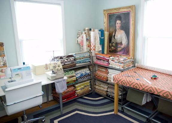
This morning Little Green Notebook featured Melanie of Plum Cushion's house tour.  I've been reading Melanie's blog for a while now, but somehow I've never seen pictures of her workroom.  Melanie makes high-end pillows that I've posted about before, so her workroom is full of gorgeous fabrics. (LGN's pictures of the workroom seem to be an updated version of the original Plum Cushion post--that cool painting isn't there in the original version.  The entire house tour is beautiful and worth checking out.)

images via Little Green Notebook


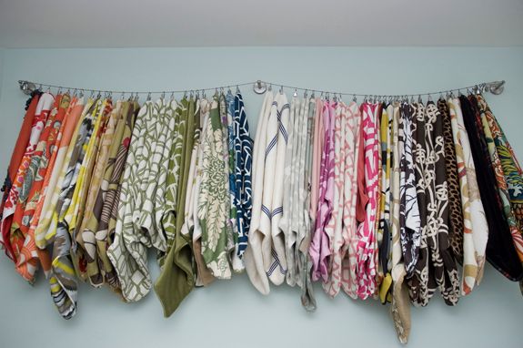
I am coveting this room---imagine having all those Trina Turk, Schumacher, and Kelly Wearstler fabrics in your house, just waiting to be played with.

I can barely sew. I have never sewn anything but a paper towel so far. I have no idea why I am so obsessed with expensive fabrics.


Tuesday, March 29, 2011

my personal design manifesto

Because "manifesto" sounds better than "self-indulgent design navel-gazing."

I've read a lot lately about designing a home around things you love.  Don't buy junk.  Don't fill up a space with placeholders.  Only buy things that really speak to you.

Its good advice, but I think there's a few problems inherent in that.  Obviously not everyone has the budget to strictly buy things they love, but more importantly, many people don't KNOW what they love.  I didn't.  It has taken me years to figure it out.  I've suffered many, many, many furniture buying mistakes.  I have thought that I just get bored with with my stuff, but the problem was really that the stuff just wasn't what I REALLY like.

I wasn't until I started reading design blogs about three years ago that I gave serious thought to what I actually wanted in my house.  In fact, its only within the last six months I've actually gotten a handle on what I really like.  I've spent alot of time refining my ideas about what I want.

I think its fairly easy to figure out what you don't like.  I can't stand primitive or shabby chic. Anything that has paint chipping off it makes me want to grab a sander and a paintbrush. (That doesn't mean YOU can't like it. Its just not for me.)  I don't like most tribal or southwestern influenced stuff, like kilim rugs or Navajo baskets. (I know, they are so hot right now! But I don't like them.)

Here's a design blog heresy--I don't really like gray.  Yes, I know, its so fresh and updated and is to this decade what builder beige was to the 90s (which means it will be outdated eventually), but I don't really like it.  I can see a room done in grays and think "oh, how pretty" and appreciate it aesthetically, but it doesn't SING to me.

A more confusing category is stuff I like but don't want in my house.  I like to look at fifties and sixties modern (hello, Mad Men), but I don't like it in my house (although the Mister does).  That has been a hard lesson learned.  That would be the problem with my bedroom.  Its calming and attractive, but I don't like the bedframe or headboard (that's a post for another day), the open shelving side tables (used because they were free, not because I like them), and I'm over the Marimekko print.  They are all just too modern.  Modern stuff strikes as me great in kids bedrooms, because it feels a bit childlike to me.  (Again, YOU can like modern all you want!  I'll come to your blog and admire it too!  I just don't want it in my bedroom or my living room.)

Here's a great picture that totally encompasses the above paragraph--I think this is a lovely room, well-curated, and there is a lot of thought and effort put into the design.  But I'd never decorate my house this way (well, aside from that peacock mirror):
image via Jonathan Adler Interior Design


That light fixture is pretty cool, the room is colorful, that orange hanging chair in the corner is interesting.  But, I don't like the style of the chairs, the tribal fabrics or the kilim rug.  While the light fixture and orange chairs are cool and interesting, they wouldn't fit in with my antique secretary or chinoiserie chairs.  There's contrast, and then there's "it just don't work cuz I don't like it."

 I love brightly colored items in stores, but when I put them in my house I'm not happy with them.  Over the past few months I've pulled out most of the BRIGHT BRIGHT stuff in our living room/dining room and replaced it with more muted colors.  Its still colorful, but not jarring or bright.  I'm much happier with it.

I need to live in a place for a while before figuring out how I need and want a space to function. We've been in this apartment for about 18 months, and I'm just now feeling happy with the way things are turning out.  We lived in our previous house for three years, and for a year we only had a sofa in the front living room because I kept trying to make the tiny back room act as our family room. It was three years of living in that house before I figured out how to arrange the furniture into a way that made sense for us.

So what is my style?  I think the Mister and I have fairly similar styles, although he tends more towards fancy modern (think Room and Board) and I tend towards shiny and glam (think Hollywood Regency).  Together we are very traditional + a wee bit of modern + glam.

One source that has helped me solidify my ideas about design in the magazine Southern Living.  I love 99% of the designs they feature. (Though their website kind of sucks. I couldn't find any of the below images on the site and had to borrow them from the blog Green Street.)

Here is a living room featured in Southern Living that embodies my personal style and what I want my house to look like.  This room sings to me--I love everything about it.


The velvet sofa, the Pier 1 mirror with the mirrored sconces, the blingy chandelier, the traditional fireplace with built-ins:

The traditional secretary with the modern lucite stool and the natural jute rug:
living room images via Green Street


I just love the whole room. Its largely traditional but with a few modern and glamorous touches.

Its taken 36 years, but I've finally figured out what I love and am working towards filling our home with it.

***UPDATE:  The Mister just told me he doesn't like the Southern Living room.  Oh, the irony.  
technical question

Peeps, I am having the most bizarre problem with my blog.  Whenever I try to publish, preview, or basically do anything with my blog, I get a pop-up window that says "the server at betternow.typepad 80: requires a password" and gives me a login window.

What on earth???  Better Now is a really good blog that I read, but I have NO IDEA why anytime I try to do something on MY blog it is prompting me to log into SOMEONE ELSE'S (typepad! not even blogger!) blog.

Can anyone help??

Monday, March 28, 2011

welcome to the gun show!

I've been working out.  I can't say I've seen a big difference.  However, yesterday, while in Target trying on elbow-length sleeve shirts, I noticed this:


That, my friends, is a BICEP muscle. No bicep muscle has been seen on my arm since 1994.  You'll notice my tricep is still shy and hiding out of sight, but my bicep?  Bringing it ON LIKE DONKEY KONG. 

Sunday, March 27, 2011

craft closet

We live in a pretty spacious apartment.  There are plenty of closets, and the rooms are large.  But what I really want is just one more room---a room that is mine, and only mine.  I've talked about this before; my room will have large floral curtains, a white lacquer parsons desk from West Elm, and an Expedit shelf unit.

But today I am attempting to finish a project, and I can't find half the supplies I need.  My fabrics and fabric-y stuff are kept in a deep narrow closet in a plastic bag beneath all our cleaning supplies and behind the vacuum and brooms. Accessing them involves stepping into the closet and wrestling the vacuum cleaner for top position.

My other supplies are kept in the turret attic.  The outside of the foyer looks like a castle turret, and there is a small, octagonal space above the foyer that I use for storage, and it has joists and a weird platform thingy in it, and is only accessible from the back of the coat closet.  It is filled to the brim with tools, chairs, side tables, painting supplies and decorative items that aren't being used.  Accessing anything in here requires tiptoeing on top of paint cans, and unloading half the chairs into the foyer to get the far wall.

I want all my supplies in one place.  I want all my stuff in pretty baskets.  I want all my stuff locked in a cabinet so that no one else can take my stuff and forget to put it back.

I want to see all my pretty fabrics.

 I'd like to add the Hemnes glass front cabinet to my office, so I could line up all the fabrics and see their prettiness while I wait for inspiration to strike.  I saw (what appears to be a) Hemnes cabinet on the blog August Fields.  Doesn't that look perfect?


images via August Fields
Next house, I hope.


Wednesday, March 23, 2011

playing outside

The weather here lately has been crazy--75 degrees one day, snowing the next.  We've tried to take advantage of the 75 degree days.

We bought Peter his own scooter, since he was so enthralled with Greg's. Its been a good purchase.


 I took 400 shots over 2 days, and this is the only one where Greg is both smiling AND looking at the camera. Its like hunting lions in the wild--you gotta be really quiet and sneak up on their blind side.


The next Kareem Abdul Jabar.


Peter fixes the door for Nonno.


Tuesday, March 22, 2011

shower curtains

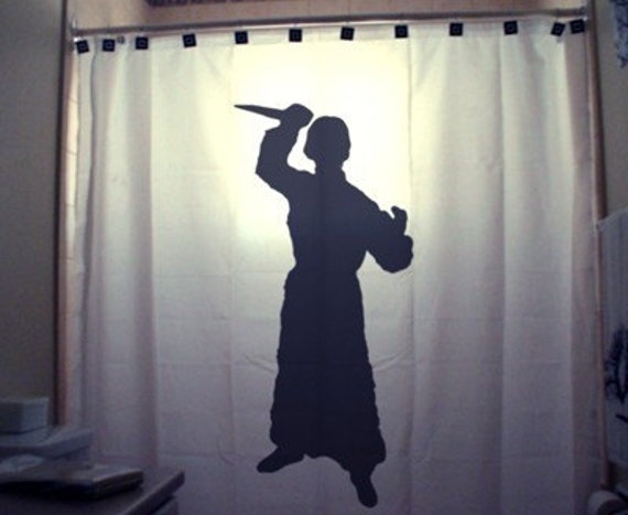
Since the Mister is oppressing me by not allowing me to paint the bathroom pink, I will engage in some retaliatory shower curtain shopping.

This white and charcoal one would go nicely with the gray and yellow in that bathroom:

but I prefer a pretty pattern.

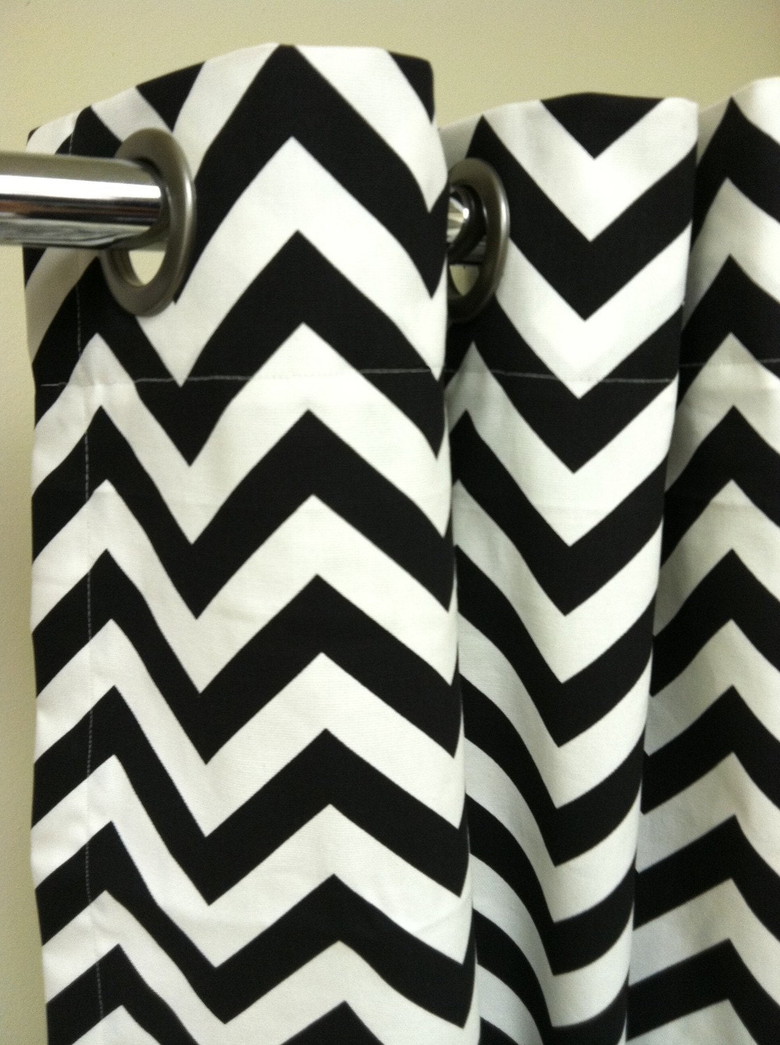
This chevron shower curtain from Maison Boutique (in yellow) is what I would love, and someday, I WILL have these (in yellow) chevrons as curtains in my next house:


But $90 for a shower curtain is over my budget.  I was thinking $50 for the entire bathroom, including new bathmats and some art.  Ok, maybe $100 for the whole thing.  Maybe.  That assumes I find something I like.   Which I probably won't, seeing as I'm not all that fond of gray.  It would be cheaper to just buy a $30 gallon of pink paint.

I did learn to sew recently, I could try making the yellow chevron one myself. (Hahahaha....) The shower stall is 48 inches wide, and the fabric is 54 inches wide....not a lot of room to make mistakes.  Which I'm sure I will.

Joi at Nuestra Vida Dulce made her own chevron curtains, with paint.  I could buy a plain white shower  curtain and paint chevrons on it, although I have my doubts about how precise my efforts would turn out. Especially since attempting stripes in my bathroom defeated me.  Imagine me trying to evenly paint a zig-zag.  Math is not my friend.

Do you think that a painted shower curtain would work in a bathroom room that gets very moist (10 points for using the M word) and steamy?  Or am I just asking for trouble?

If I can't paint the bathroom pink, I don't really want to paint at all. So I need a shower curtain that goes with gray floor and yellow walls.

So here is where I would put all the gray and yellow shower curtains I would like to put in the bathroom, except I CAN'T FIND ANY.  Seriously.  I can't find a single yellow and gray shower curtain online, except for one on Etsy I didn't like.  Seeing how freaking popular the yellow/gray combo is at the moment, and that Target has an entire bedding line devoted to those colors, you'd think they might have a shower curtain?  No. At least, not in any of the Targets around here.

Retaliatory shower curtain shopping DENIED.  

Monday, March 21, 2011

fabric scale

Last week I ordered some fabrics from Fabric.com:

Metro Living Tile Garnet

Metro Living Tile Natural


Kaufman Luca Teal

Despite the fact that the little ruler on the bottom clearly shows that the scale of the fabrics are very different, I didn't really notice that.  I also was thinking that they were all upholstery weight.

Well.  They aren't the same scale, nor are they all upholstery weight.


The middle one (the Kaufman Luca) is upholstery weight and a lovely fabric, but too big a print for the chair I wanted to put it on.  The smaller tile prints are not upholstery weight.  Also, the Mister didn't like any of them.

So....I guess I'm adding all of these fabrics to my brown bag of fabrics in the closet until I can find another project for them..


Sunday, March 20, 2011

Honeycomb/peacock mirror (or, my foyer, version 426)

I've had my eye on this Honeycomb mirror from Pier 1 for ages.


Its a knockoff of a much more expensive mirror from Wisteria.  I remember the first time I saw this was a few years ago in a Domino spread of Liz Lange's apartment, decorated by Jonathan Adler.  And you know what?  I didn't really like it at the time.  But I've since changed my mind.

image via apartment therapy

The Pier 1 mirror finally went on sale last week.  And promptly sold out.  I called every single store that the website showed had it in stock.  Most were hours from here.  Only floor models were still available, and multiple salespersons told me "we can ship it FedEx, but we don't have a box for it so we wrap it in bubble wrap, and it will probably be broken by the time it gets there." (WTH???)  When I called the store closest to me, the salesperson told me theirs was damaged, and I could come look at it, but she had THREE OTHER PEOPLE  on hold AT THAT MOMENT calling about the same mirror.  Yeesh.

The store at the Christiana mall in Delaware (over two hours from here) had one that was minimally damaged (a few of the outer mirrors were missing).  My sister lives in DE, so I bought it over the phone and my little sister brought it up this weekend.

A few of the mirrors were missing, so I got a 20% discount and am pretty happy with the price I paid.  I popped out one of the little mirrors, took it to a glass cutting store, and got replacement mirrors for $10.  And here it is:


Five of my favorite posts

I had a hard time picking just five.  Actually, I picked six.  I also limited myself to non-design related posts.  Perhaps later in the week I'll put together a Top Five design-related post.

1.  No Mexicans Were Harmed in the Making of this Casserole
This is a post about the worst dinner of my childhood, the Mexican Casserole.  (You can read the companion piece where my sister made Mexican Casserole for dinner the next day, and it still sucked.) As I was re-reading the original post, Peter sat down next to me, looked at the picture of the Mexican Casserole, and said "ewwww, that looks gross, I don't like that."

2. Flying with Style
Peter and Princess like to jump off the sofa.  The last picture is a classic, with Princess bracing for impact.

3. Going to the Park
This post is a glimpse into my daily interactions with Greg.

4. In my Day
The things that come out of your mouth when you are old, like "in my day we didn't have crap from China!  I played with sticks and cardboard boxes!"  Oh yes, I said that.

5. Want Some Lemonaide?  Too Bad.  A photo essay about someone's bad habit of putting empty containers back in the fridge.

And a bonus:
6. The Length of my Skirts
A post about my change from a teenage Sassy Short-Skirt Sally to an adult Laura Ingalls.  If you want an update, I did not return the skirt, but neither have I worn it out in public.

This post was a homework assignment for a class I'm taking.  Its a pretty fantastic class, called Blogging Your Way, offered by Decor8.  It is chock-full of information (I can barely keep up with all the reading), and has homework to make your blog better.  Check it out.  

Saturday, March 19, 2011

el hideoso banyo

I've been contemplating what to do with the Mister's bathroom for a while. Its on my list of Projects to Tackle in 2011.

That thing on the left that looks like a dirty smudge is actually the reflection of a towel on the opposite wall.

The bathroom in our old house had a western facing window that got a lot of sun, the tile and fixtures were all white, all the molding was white, and the flooring was a laminate that looked like broad-plank birch.  I painted the walls a warm gray, put up a Pottery Barn Bettina shower curtain (the one in the picture above, now discontinued), and used navy and orange towels.  I really liked it.  (Sorry, that was pre-blog, I don't have any pictures of the old house.)

In this apartment, the second bathroom has gray floor and shower tiles, a gray toilet, and a white eighties modern-ish laminate vanity (clearly I should change a few lightbulbs). It also has a skylight and a sloped ceiling.  Perfect, I thought.  I'll just transfer the whole Bettina shower curtain/orange/navy accents theme right in.  I did; I even painted it the same warm gray (also pre-blog, no pics).

I hated it.  The gray on the walls, combined with the gray on the floor, the shower and the toilet, and the vanity looked so cold and sterile.  Although the room does get sunlight during the day from the skylight, its not a direct sunlight.  This design just didn't work in here.

My second attempt was to paint some stripes on the wall.  The math involved brought me to the edge, and then taping the stripes off in a level fashion did me in. My laser level suuuuuucks.  

The third try was to pick up a warm off-white for the room to brighten it up.  I almost always do paint swatches, but this time I didn't.  (Dun dun dun....)  Of course, the off-white I picked is actually yellow.

I've seen some lovely pink rooms in the blogosphere lately (see herehere, and here ), so I thought that the bathroom would be a lovely place to bring some pink into our house. The pink is already in the curtains, not that I would go such a deep coral, but I think a light peachy-pink would be perfect. I picked up a few to try:

I don't like any of them.  I am thinking of a very light peachy pink shade, and none of these are it. I think the peachy-pink in Bryn Alexandra's room is what I'm going for, so I should probably just go pick up a sample of Cameo Pink by Ralph Lauren.

I'd also like to paint the vanity a dark gray (Behr's Dark Granite, since I have half a gallon in the basement.)  I think the dark gray/light gray/peachy-pink/navy blues would go nicely together.

Aaaaaaaand.....my plan to paint the bathroom pink has hit a snag.  The bill has been passed to the executive branch and the pink was excised in a line item veto, if you will.   I am not to paint the bathroom pink, despite its universally flattering effect on skin tones and its popularity in the blogosphere.

Le sigh.

Thursday, March 17, 2011

New bust!

No, not that kind.  Har har.  Cosmetic surgery takes a backseat to buying new furniture around here.

Remember when I said I was looking for a bust? I finally found one.  At Homegoods, for only $12, and she is petite and dainty and a delicate milky white.


Tuesday, March 15, 2011

the kids' room revealed

Its done!  The Princess is even sleeping in there.  At least, she starts out in that room before switching to prime kidney-punching-position in my bed around 2 am.

The before was very orphanage-style, cramped and cluttered. There were two dressers; one for the Princess and one shared by the boys after the Hemnes dresser fell apart.  The boys' dresser was crammed into the closet in order to make room for the changing table and bookshelf.   We also have the ginormous Pottery Barn Lullaby rocking chair.


The after is still orphanage style (there are three kids in a 15 x 15 room, it is what it is), but I think it looks a bit nicer and is less cramped.

We lined up the beds under the window:


We put up a large map from Ikea:

We bought new Malm dressers from Ikea so each child has their own dresser, and put them all together for a dressing area. The maple color of the dresser in the middle (that we already owned) was discontinued, so we went with the white stained oak color for the two new dressers.


My homeless orange lamps came upstairs from the basement, and I added some pictures of the kids as art over the dressers:


We took out the changing table and bookshelf and installed book ledges:


The bedspreads on the boys' beds are from Target a few years ago.  They are *very* vibrantly colored, with pictures of zoo animals.  The curtains are from Pottery Barn Kids a few years ago.

I added some of our Costa Rican souvenirs--suns and moons around the room, and a small mirror over Peter's bed.  Even the pictures over the dresser are from a vacation in Costa Rica.


This little mirror is right over Peter's bed, and is the perfect height for him to see himself.


 The light fixture in the room is a map of the world, and I think its pretty retro cool.


I did not want to completely overhaul the room. My main goal was to make the room more usable than what was we had.  I liked the bedding, curtains and furniture we already owned. I really wanted to use the campaign nightstand and desk that I got off craigslist a few months ago, but unfortunately they just didn't fit in the room.

I tried to keep the expenditures to a minimum, and I (sort of) succeeded. The only items I bought specifically for the room were the two dressers ($300), the map ($150) and the Ribba ledges ($120), for a total of $570.  Everything else in the room we already had.

Monday, March 14, 2011

art for the kids' room


I've been looking for inexpensive art  that would be good in the kids' room above the dresser, but nothing has struck my fancy.   I'd also like to finish this room, so I didn't want to drag on looking for months and months for the perfect piece.  I gave myself a challenge to fashion some kind of art out of stuff we already had.

We had some bird prints, an inaccurate canvas painting of the solar system (goodbye, Pluto), a bunch of empty frames, and a couple of large mirrors.  Since the kids aren't tall enough to see the top of their dressers, putting a large mirror up there seemed pointless.  None of the other pieces were large enough to hold the space on their own.

Looking in the attic, I found some blank 11x14 canvases I had picked up at a two-for-one sale at Michaels, along with some red ribbon.  Rummaging in the brown paper bag that holds my fabric stash I found the remnants of a really bright turquoise tablecloth with a quatrefoil pattern.  I also had three bright green picture frames from Target.  Voila, art.

I wrapped the canvas frames in the turquoise fabric, and stapled the back.  I tapped a small nail into the inside top part of the canvas frame.


I threaded the ribbon in the back of the frame hanger.

I hung the picture on the canvas, looping the ribbon around the nail in the back of the canvas.


I picked some pictures from our recent vacation in Costa Rica.  Here's Peter testing the waves:

Princess wearing Grandma's sunglasses:

Greg jumping the waves with Papa and Nonno:


I think the room is finally done.  Big reveal tomorrow.