Wednesday, September 28, 2011

shower curtain: the one that got away

I've been searching for a shower curtain for the downstairs bathroom. I don't think I've ever posted a picture of the bathroom on the blog, but it has this fairly ugly dark green tile on the floor, with a matching row of dark green tile running around the middle of the wall.


My landlords must love this green, its the same as the rug upstairs.

Decorating around the green has proved challenging.  No one seems to be using hunter green as a popular color these days.  Tobi Fairley has put out a lovely line of kelly green fabrics that might work, but I can neither afford her fabrics nor does she make a shower curtain with those fabrics to my knowledge, so we will just have to admire from afar.

I found the perfect curtain at Urban Outfitters:


Lots of green that won't clash with the green tile, but also tons of happy yellows and blues and pinks.

Aaaaaand its out of stock, never to be ordered again, according to Urban Outfitters. Can't find it on ebay, or craigslist, or anywhere else, and waaaaah.

Today I went to the Urban Outfitters website, and saw the curtain, and saw that it was in stock, and excitedly emailed my sister that HEY THAT CURTAIN WE LOVE IS BACK IN STOCK and so I ordered two, one for her and one for me, and then I was looking at my order confirmation and it said Woodland Garden Curtain.  Not SHOWER curtain, just curtain.  And I went back and looked a wee bit more closely and oh crap, I ordered the wrong thing.  Hey sister! Remember how we were all excited about that shower curtain?  Get unexcited.

The search continues.


Tuesday, September 27, 2011

Princess's room, mostly finished

Princess's room has been 98% done for a while.  There's a few more things I'd like to do in there, but for now, here's what it looks like:


As you can see, its not a very big room.  I think its about 9x11, and it doesn't have a closet.  Luckily Princess refuses to wear dresses, so all her clothes fit in a dresser.


The inspiration for this room came from the Pottery Barn Kids drapes that I picked up earlier this year.  This print came out when I was pregnant with Peter, but since we were having a boy, I had no need for it.  Even though Princess was sharing a room with the boys in our old apartment, I bought a pair of these curtains when I discovered that PB was discontinuing the print.  Then I had to scour ebay to find another pair when it turned out the new house had two windows in her room, not just one.  I wish that I had been able to find 96 inch curtains so that I could hang them above the window molding, but maybe one day I'll get around to adding more material to the bottom.


As you can see, the light in the pictures varies dramatically.  Its been a difficult room to shoot; I've been taking pictures of it for weeks, trying to get the far wall not to be dark and underexposed.  I've finally gotten a good shot of it.


The previous tenants had a little boy in this room, which is why those sports balls are on the door...they seem to be adhered with incredibly strong glue, as I have been unable to get them off without damaging the door underneath.


The one project remaining in here is something over the crib. I have thoughts of attempting to DIY a monogram, but have been in no particular hurry to get it done.


The source list for this room:
The crib: no-name, bought from a toddler and teen place after discovering Peter's drop-side crib was a death trap
Curtains: the Emmy pattern from Pottery Barn Kids, you can still find some on Ebay
Rocker: discontinued Lullaby rocker from PB Kids
Dresser: Malm six-drawer dresser, painted with an ombre treatment of Benjamin Moore's Autumn Red mixed with Decorator White
Mirror: Homegoods
Bookshelves: Ikea Bekvam spice rack
Rug: Overstock, you can find a similar one here

You can read more about the individual projects in this room:
Mood boardDressershoe memento box and tissue poms, spice rack shelving, ribbon trimmed roller shades, matriyoshka dolls, stripe paintings, orange dresser, rug fail, curtains and paint

***********
I'm linking up to the Roomspiration party at ala mode.  Check it out, there have been some fabulous rooms in these parties so far!


Friday, September 23, 2011

new blankies

Its been getting cooler here, and soon it will be time to bring out the winter blankets.  My summer blanket is a pretty coral, but my winter blanket is a dark brown stripe that doesn't go at all with my pretty bedroom.  However, its a massive, enormous blanket, its thick and warm, and it covers all five people who end up in my bed every night.  I tried all last winter to find an alternative, but nothing fit the bill.

Instead of trying to find a new blanket that fits our extensive requirements (must not be a duvet, must be quilted, must be enormous, must be extremely warm yet not too heavy, must be a down alternative, and on, and on, and on...), I've decided to attempt the duvet one more time.  I hate duvets. Which is sad, because generally duvets are the most beautiful bedding. But I find that the blanket always slides around the inside and that drives me nuts. Regardless, I will give the duvet one more try.

I've made a few mock-ups of possiblities. I plan on buying two 16x16 chiang mai dragon pillows for the bed, regardless of what duvet I might pick.

I could go with a navy blue duvet, the coral Euro shams I already own, and the chiang mai pillows.  Drawback to the navy blue duvet--that attracts lint and crap like nobody's business.  Yes, I am the kind of person who will take a lint roller to her bed on a daily basis if needed, but that doesn't mean I want to.  Especially since I'm already lint rollering the boys' beds.

Or, I could do the navy blue duvet and greek key Euro shams.

Greek key duvet with coral shams? My fear with this one is that the brown blanket will show through the white duvet, which is very thin.

Blue ikat?  I love this pattern but it seems a bit too cobalt blue and not navy-ish.

Your thoughts?


Roomspiration dining room party


Sorry I did not get this link up earlier, but I linked up to the Roomspiration Party at Involving Color.  There were some fantastic dining rooms over there, check them out!  I am hoping to get pictures of the Princess's room up for next week's nursery post as well.  (The boys' room is....not going up for a while.)


Thursday, September 22, 2011

china cabinet progress

I had high hopes of finishing this by today in order to link up to the Roomspiration party, but....no.  Maybe by the weekend.


Got any home improvement plans for the weekend?

Tuesday, September 20, 2011

picture ledge gallery inspiration

I am so enamored of the shelf-style gallery, with all the art or photos leaning against the wall and layered on top of each other.  Its also a concept that can be executed in so many different styles. My gallery has a more casual vibe, with frames in every color of the rainbow. You could use the same style of black frame for a more formal look, or thrifted funky frames for a vintage vibe, and so on.

This picture of India Hicks's dining room is what started my fascination.  I love how crammed full of history the shelves are, inviting you to come closer and explore each picture.  The frames seem to be mostly black, brown and gold, which fits into the more formal dining room.


Just in case you haven't seen enough of India Hicks's dining room, here's another side view....I have not found any pictures depicting the entire room.  If you see any, let me know.


I like this room for its large, blown-up photos.  The larger scale looks simpler, and having less photos on the shelf lets you focus on each in turn.


The next two galleries are moody and monochromatic, with a modern look.


There's also the casual, collected over time look.


You can take this concept in so many different directions! Are you as enamored of this look as I am? (I'm guessing not, but I think its fabulous.) 

Sunday, September 18, 2011

dining room picture ledges revealed

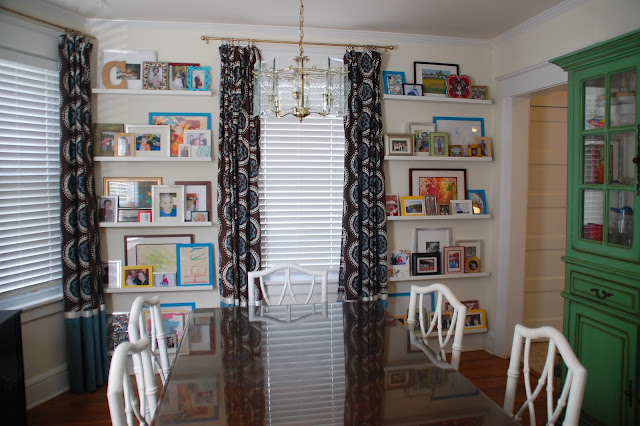
If you've been reading for a while, you know that I've been in love with this picture of India Hicks's dining room forever.  We didn't have a place to put a wall of picture ledges in our last house, but here, there are two short walls on either side of the back window in the dining room.


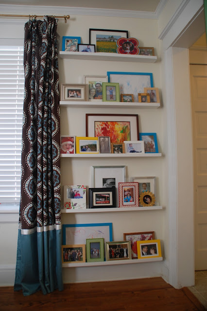
I love the way this came out.  I bought a four large turquoise 17x14 frames from Ikea ($3.99 each) and three Ribba picture ledges ($14.99 each), but other than that, I didn't buy anything for this project.  All of the frames were previously owned, and we re-used the picture ledges that were previously used as book ledges in the kids' room of our old apartment.


 We put up five ledges on each side, 18 inches apart.  Because of the large space between each shelf, I tried to put one extra-large frame, at least 11x14, on each shelf, and fill in with more 8x10s and 5x7s.  I did not have any 17x14 pictures, however, and didn't want to spend a lot of money on expensive mats.  Instead, I put some of the kids' art in the bigger frames.  It adds some nice color and the kids love seeing their artwork displayed.

Princess loves to stand in front of the pictures and tell me who is in each picture, and she tells stories about each picture, which is the cutest thing ever.  Every few days I like to rotate some new pictures down to the bottom two shelves where she can see them.


This room is coming along nicely.  I have a few things that are still in need of paint--the china cabinet, a different chandelier, and the art for over the sideboard.  But its slowly coming together, and I love that this back wall is what I see when I sit on my sofa in the living room.


Friday, September 16, 2011

Felt Flora art

I've been looking for art for a few spaces in my house.  I feel that I have enough photos and little tchotchkes.  While I don't have a specific thing in mind, I am looking for something that has depth, dimension and texture to it.  Something with a sculptural quality to it.  Not giant cement statues, but something woven, or wooden, or layered, and can be hung on the wall.  One possibility that fulfills these requirements is these fake Cameroon juju hats I've mentioned before.

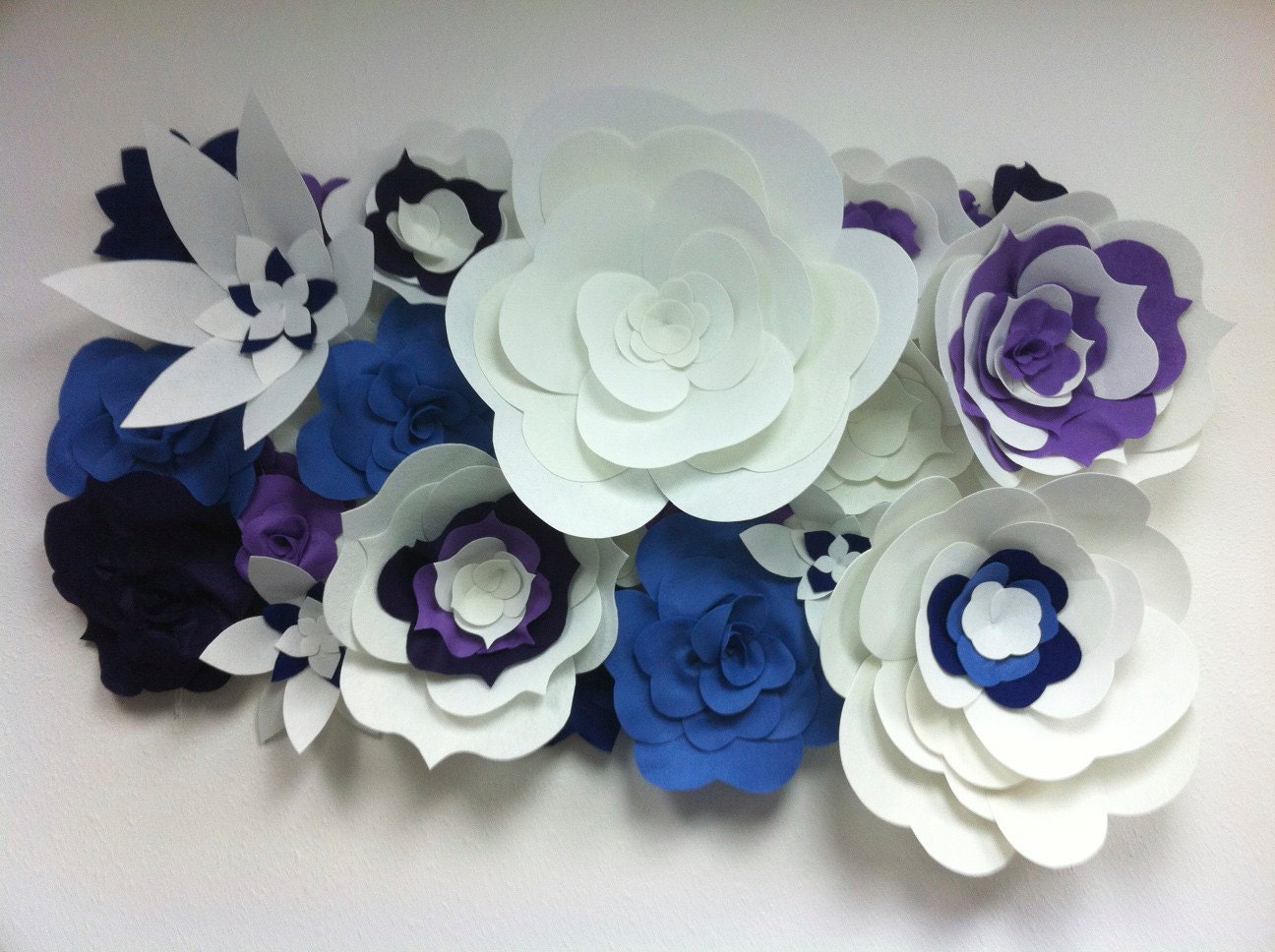
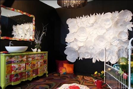
Today I was reading Kim Myles's blog (of Design Star and Myles of Style fame), and she showcased these felt floral thingamabobs sold on etsy.  I think these are SO COOL.


I'm not positive, but I think the two above are actually two panels together, as they are sold per square foot.  

There's a large number of colors to choose from, and you can put more than one together for larger installments, like this enormous one:


Neat-o, right?

Thursday, September 15, 2011

weird-size art for the dining room

I'm searching for art to hang over my sideboard in the dining room.


 The sideboard sits under a window, and the space between would be suitable for a piece that is approximately 20x40. I'd like a single, large piece of art in that space, as I feel there are lots of small collections on the first floor (especially in the dining room, which I haven't posted about yet). Twenty by forty is not exactly a common size, and I'm reluctant to invest lots of money into weird-size art that may not have a place in our next house.


I came across this picture on 20x200, and it has totally captured my imagination. Sadly, it doesn't come in the right size, and even if it did, its way out of my price range.

Think I could DIY something like this? I have learned making that attractive art is way harder than you think it should be.

Monday, September 12, 2011

first day of school, for me this time

I saw one of those inspirational sayings on Pinterest that the work you do when you are procrastinating is probably the work you should be doing for real.

I spend a fair amount of time reading design blogs, design books, and decorating my house.

Today was my first day of school at Parsons' interior design certificate course.


It was fun :-)

Forgive me if posting is a little light in the next few weeks while I get settled.

***********

I linked up my console post to Abode Love's link party.  There's some fun stuff over there, go check it out! I hope I can get some more posts of my dining room up in time for the next party.

Roomspiration


Sunday, September 11, 2011

my styled bookshelves

I styled our bookshelves:
 
In our last two houses, we have not had a place to put our books out on bookshelves for easy perusing. Instead, we have had one large bookshelf with doors, where each shelf was crammed two or three books deep.  Right before we decided to move, I bought two white Billy bookshelves, put them facing each other in a bump-out in the living room, and put the books so we could easily see them.  It was lovely, but then we moved.  

In this house, I put two bookshelves in our living room.  We have more books than we have space for, so I added an additional bookshelf in the basement.  I displayed some of our larger tchotchkes on the shelves among the books.  It just looked cluttered.

I knew this, but I was reluctant to get rid of the books or the tchotchkes.  I really enjoy having our books easily accessible, rather than packed in boxes in the basement.  Then it occurred to me--the ledge in the attic stairwell could hold two small Billy bookshelves.

I bought two small bookshelves and put them on the ledge, then moved half of the books upstairs.  The books I read the most I kept downstairs in the living room.  I also bought doors for the living room bookshelves.  Our frequently read books and magazines now live behind those doors.

All the tchotchkes were moved to the top three shelves.  Because the waxy cardboard back of the bookshelves does not take paint easily, I took two large pieces of foamboard, cut them to size, painted them Gossamer Blue, and put them in the back of the bookshelves behind the shelves.   Then I arranged our tchotchkes.  

All of the tchotchkes we already owned, and most of them are from friends or have a story behind them. 


I won't bore you with the stories behind every piece, except one.  The blue and white ceramic mask on the second shelf was made by my baby sister when she was in middle school.  Its looking worse for wear (it used to have ears and teeth), but it always gives me a giggle when I look at it.  That mask has been in every house I've had since my dorm room in college.  

That second shelf with my sister's mask on it is still a work in progress; the only things I really like on it at the moment are the mask and the painting.  I consider it room to grow.  New adventures will find their way onto that shelf eventually.  

Friday, September 9, 2011

new console and ceramic pieces

Our stairwell has a new console piece and I hung more art:


When we first moved in, we put the antique secretary in this spot.  Its a fairly narrow piece, so it fit fine, but even though the legs are fairly high, the piece still blocked the the return air grate it was sitting on top of.  During a heat wave we moved the piece over a few feet, but that meant that that the top of the secretary was taller than the bannister.  I really didn't like the way it looked.  

I took the top off, but then it just looked like a rather squat piece of furniture in a longer space.  The angled line of the orangy brown bannister  broken up by the short secretary did not look very harmonious.  A few weeks later I moved the secretary to the other side of the room, where it looks much better.  I searched for a long console table, and considered a number of options (here and here), but then I came across this piece on craigslist.  Its long, its fairly low, its open on the bottom over the air grate, and its just a lovely piece.  

The triangular piece of wall above the table seemed like the perfect spot for our ceramic pieces from Italy.  I cut a piece of craft paper in the shape of the triangle:

I arranged all the pieces on the floor on the template (forgot to take pictures of this step), drew around the shapes, then taped the craft paper to the wall and hammered in all the nails.  I gently ripped off the paper and then hung the pieces.


This was the piece that started our collection, and its still my favorite.  We bought it on our first trip to Italy in 2003, right before our wedding. I've bought more pieces every time we've gone, and I've asked my inlaws to bring back pieces when they go.  


Of course, as always, this area is a work in progress.  Here is what the the area looks like before I removed everything for pictures.  


The only phone jack in the house is under the table, so this is where the phone and all its attendant wires live. I need to figure out how to hide those wires.  The lampshade sustained some damage in the move, so it needs to be fixed.  The chair practically blends into the stairwell with all the brown, so it needs a fresh coat of not-brown paint and a new fabric for the seat.  

I'd also like to find a long low box with a lid for mail, since this is right inside the front door.  But I'm happy with how this space is shaping up.