Tuesday, May 31, 2011

glossy black vs coral

This weekend I painted our bedroom dressers a high gloss black.  The jury is still out on this one.

We bought our dressers in a tiny discount furniture store in Red Bank about ten years ago.  They were inexpensive birch veneer, and the headboard and mirror were a knock-off mission style. The dressers are fairly inoffensive and have no particular style.  I didn't particularly like them, but we got a bed, two dressers, two nightstands, and a mirror for a very good price, and price was more important than style at the time. (This was before I discovered the wonder of craigslist, or started reading design blogs.  You youngsters don't know how good you got it.)

After a few years I painted the dressers.  They've since been red, a different red, green, brown, a different brown, then brown with the white fronts, and now glossy black.  These dressers have been through nine moves, and while they are still going strong they are starting to show some wear and tear, and to be honest, were not all that attractive to begin with.

The high gloss black is really showing every imperfection and less than smooth surface.  I'm thinking a matte black might have been a better choice. I'm reserving judgment until the new hardware is delivered. (I'll put up pictures when the hardware gets here.)

And then.

This afternoon I saw this:
image via belle maison


I think I need coral dressers.  

L'orange: the creamsicle dresser

The creamsicle dresser actually came out quite nice, bubbly paint notwithstanding.


I am glad I didn't go with the darker orange, this is a pretty intense orange as it is.

I've ordered the rug for her room, I have all the curtains, I'm looking for art, and I need to figure out how what color to dye the rocker.  And oh yeah, move to the next place.  Progress!

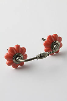
Opinion poll: would you put pretty knobs or pulls on a Malm dresser, or is it just too modern to do that?  I have seen plenty of mod, plain drawer pulls on the Malm, but not too many pretty pulls like this:


(Ten of these pulls, btw, would cost more than the dresser itself.)  

I see on Apartment Therapy someone put some fancy pulls on the long Malm dresser.  Hmm.

Sunday, May 29, 2011

painted the side table black

I'm just going to paint everything in the entire house high gloss black.  Help me, its a sickness.

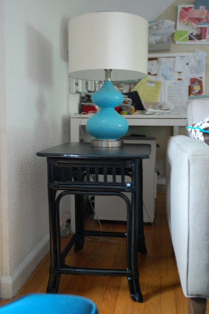
I picked up this bamboo side table at a garage sale about a year ago, prior to the blog. It was a sickly green color then.  I painted it white when I was going through my "paint everything in the house white" phase.


Now I'm in a "paint everything black" phase.  In this house, the walls are a warm beige, so all the white furniture stands out.  This table was up against a white wall, and kind of faded into the background.  In the next house all the walls are white, and so I'm overcome with the desire to colorfully paint all the furniture.

I'm pretty happy with it:


Friday, May 27, 2011

allergy season

For the past few weeks, we have all had terrible allergies, with sniffling, sneezing, runny noses, and hacking coughs.  We took Peter to the emergency room one night because he could barely breathe for coughing and I thought he might be having an asthma attack.  Luckily it turned out to be temporary allergies and not asthma, but he is still taking a huge number of medications for another six weeks, till allergy season is over.

This is why we are having such terrible allergies.

That's not snow.  Its....um...allergy stuff.  Pollen?  It comes off these trees--see the long furry fuzzy things?

And for weeks, it looks like its snowing while all this crap falls off the trees.

We will all be thrilled when our sinus headaches go away.

Funny story--I think it was about this time last year that we had a fire in the kitchen.  I remember because we were sitting outside on the front lawn, waiting for the fire trucks, and the fire trucks pulled up to our street, but turned down the wrong way, because there was SO MUCH of this pollen flying around that down the street it looked like swirling smoke clouds.

***********

Whatcha all doing for the holiday weekend?  My sister is coming for a visit, and I have some scintillating plans to do some packing and painting of furniture.  Auntie Sarah loves to visit, I always put her to work.  


Thursday, May 26, 2011

MW rugs for the Princess room, and more orange paint

The boys'  room will need a rug, and the Princess's room will need a rug.  I plan on using our brown trellis rug in one of them.  Originally I had planned to use it in the Princess's room....but I keep coming back to these gorgeous rugs from Madeline Weinrib.  They are pink! And orange!  And sometimes pink and orange together!  They are also a zillion dollars.  A girl can dream.  

Hot Pink and Orange Brooke


Orange Zig Zag
Hot Pink and Orange Westley


Pink and Orange Lulu


Orange Talitha


I also decided I wanted her dresser to be orange. I went to Sherwin Williams, which has a much larger selection of oranges than old fuddy-duddy Benjamin Moore, and here's what I came home with.

Orange is a hard color to pick.  Ack.  From the picture I'd say that Tango is the most "matching" but the Tango is a REALLY strong, bright orange. I'd like something a little softer.  I think I'm between the Inventive Orange and the Orange Appeal.  

That Rejuvenate is awesome coral color, though, and I must find a project for.  It reminds me of this picture

Tuesday, May 24, 2011

orange or pink?

Since its a long holiday weekend coming up, I plan to do some furniture painting.  Right now we live in a one-floor apartment, so its really easy to pull my bedroom furniture a few feet into the kitchen and do some painting after the kids are in bed.  Once we move I will have to move the furniture up and down the stairs to do any painting, so it makes sense to do it here before we move.

One of the things I hope to paint this weekend is the Princess's Malm dresser.  I am torn between painting it pink, orange or black.

I tested a few colors:

I've narrowed it to two colors.  There's Benjamin Moore's Autumn Red, which is the most ridiculous name--it should be Bubblegum Pink as there is nothing red about it.


and BM's Orange Appeal:


Orange is a difficult color to find.  Benjamin Moore has about eight thousand shades of beige, but about 10 shades of orange.  There's screaming neon orange, there's terra cotta orange, and not much in between.  The Orange Appeal is a soft, creamy orange, not too neon, not too terra cotta.  I think it would be a nice pop of color.  But so would pink!  Or black!

SOOO MANY CHOICES.  Am paralyzed with indecision.

Five more weeks!


Monday, May 23, 2011

dining room mood board

I've been working on a moodboard for the new house dining room.  (I think I need a new name for the new house, because I plan to live there for two-ish years, then there will be another new house....should I just start naming them by counties, or number we've lived in?  This would be House #9.)

In any event!  The walls will be white and I will not be painting them.  Probably.  I'll live with it for a while and then decide.  The all white wall policy is making me lean towards colorful furniture and fabrics.

1 and 2. I love this enormous refinished china cabinet from the blog Southern Exposure (go check out the before and after pictures--its an amazing makeover).  I'd love to find something similar on craigslist.  My plan is to spend around $250 on the biggest china cabinet I can find on craigslist, and paint it a happy, cheerful red.  We have very little storage in the kitchen, and I plan on using the china cabinet for dish storage and other kitchen items.

3.  The chandelier in the house looks similar to this one, although it has a second tier of lights. You can sort of see it in the picture under number 5 below.  Three years ago I would have been all "arg, that brass chandy is SOOOO EIGHTIES".  Today I love it.  Personal growth!

4.  The curtains will be made out of this Richloom Lucy Eden fabric.  I really love this fabric and think its going to look fabulous. The dining room is open to the living room, and I also think it will go nicely with the peacock and red tones in the living room.

5.  Ah, the infamous picture ledge wall.  I'm hoping to work it in, but we'll see.  The dining room currently looks like this (but by the time we move in will be white, not red):


To the right of the dining table is where the china cabinet will be going.  Where the massive china cabinet is in the above picture--look at the top of the china cabinet---there's a window behind it.  I will not be covering up a window with a china cabinet.  So the only place left to put my wall of picture ledges is on either side of the back window, or under the half window on the left.  I can't decide if that would look dumb or cool.  So....maybe, maybe not.  We'll see.

I am contemplating putting my black sideboard under that half window on the left.  I am afraid that there will be Too! Much! Furniture! if I do that.   Won't know till I move in.

6.  We currently have the Sumner table and fretwork chairs which will be coming with us.

As always, plans are subject to change :-)

Sunday, May 22, 2011

Waverly Olana Bayleaf, which everyone hates, and some other pretty chairs

On Friday I posted about choosing a fabric, and pretty much everyone said Oh, fabric #2 is SO awesome, and the paisley Fabric #1 is not bad. Fabric #2 is going to be used in the dining room. However,  no one seems to be a fan of fabric #3. People in my real life (ahem, sister) said Fabric #3 is UGLY. 

But reader Tiffany agreed with me that it is QUITE BEAUTIFUL and the haters don't know what they are talking about.  She pointed me towards this chair sold at Horchow which is upholstered in the beautiful fabric #3:


It is quite lovely!  I LIKE IT.  All this hateraide is making me LIKE IT MORE.  

But I'm still undecided on what to do for my bedroom curtains, because the Mister is also in the "eh, the Olana is kind of ugly" camp. I want a new bedspread, because when I washed our green one after Peter peed on it, it shrank when I put it through the dryer, and now every night there is a tug of war and I really just want a blanket that covers the five people who end up in my bed kicking me in the kidneys every night.  I want a midnight blue blanket and pretty curtains that go with a midnight blue blanket.  Don't worry, a mood board for this bedroom is coming soon.  If I can ever make up my mind on what fabric to get. 

In a tangent that leads us ever further afield, as if this post isn't all over the place as it is, if you have a gazillion dollars to spend on a single chair, the choices from Horchow are amazing.  Like, stunning.  Look, aren't they pretty?

Suzani Spindle chair
Poppy orange links chair

Lipstick Rose chair

Olivia chair

I ordered more fabric swatches from Fabric.com, so perhaps we will play this game again next week. 


Friday, May 20, 2011

3 pieces of fabric

I have been perusing fabric after fabric for curtains for the new house.  I have narrowed it down to three fabrics...but I only have two rooms.  Not that I can't use the third fabric in pillows, or what have you, but I am trying to figure out which fabrics to plan each room around.  The rooms that need doing are the dining room, and my bedroom.

Fabric #1: Richloom Giverny in Camelon.  I think this would look fabulous with some brass or gold accents, and there are a ton of colors in here to pull out (red, navy, light green, dark green, pale blue, pinks and golds).


Fabric #2: Richloom Lucy Eden. I like that his has a light background but yet is so colorful.


Fabric #3: Waverly Olana Bayleaf.  I have had this fabric in my "will use someday" list for years now.


I have planned out the rest of what I want in the rooms, and weirdly enough, any of these three fabrics would work in either room.  One room has red accents, the other has navy, and these three fabrics work with both red and navy, so...I'm having a hard time picking.  

Thursday, May 19, 2011

stuff I want, and a really pretty kitchen

I am comforting myself with some internet window shopping this morning.

It has been raining here forEVAH, and I packed away my snow boots because they are fleece lined and make my feet hot.  I'd like a nice pair of Hunter wellies, in a bright red to chase the gloom away:


They come in pink, too!

I love this Anthropologie necklace; its delicate and colorful:


And I want this pretty skirt from Anthropologie:

******************
This morning I was reading Emily A. Clark's blog, and she featured this gorgeous kitchen.  This is my new dream kitchen.  Its heavenly.  Come to me, pretty kitchen.


That sink! That countertop! The subway tiles!  The beadboard ceiling! Yes, I have a bit of a fixation on glossy black lately.


So gorgeous.  You can read about the kitchen reno at Kiki's List.


Tuesday, May 17, 2011

make your own foyer

The house we are moving to is a side-hall colonial, and its very similar to the house we owned two years ago.  The front door is towards the far right and opens into the living room.  In this house, the stairwell to the upstairs is almost right in front of the door.  I don't have any pictures to show you, unfortunately.

I like a house that has a foyer that separates the entryway from the living space.  Our current apartment has a nice foyer and a large coat closet.  The new house does not have a foyer or coat closet, and I notice that the tenants have the same solution that we had in our old house--hooks on the wall that goes down into the basement.  The door into the basement is not located anywhere near the front door, meaning that you must walk in and go through to the back of the house before taking off your coat.  This is a nuisance.  It also means that the short people fling their coats on the floor by the front door.

Years ago I saw a picture in a shelter magazine that solved this dilemma by putting hanging hooks on the back of a shelving unit.  The back of the shelving unit was installed perpendicular to the front door, thus creating a small foyer area, and the front of the shelving unit faced into the living room.  I never did get around to attempting that project in our house, but this morning I came across that picture on Pinterest and thought, hmm, I may have to take another look at this.


image via pinterest

From the other side:
image via pinterest

I remember the shelter magazine being a Better Homes and Garden DIY publication, because I recall reading in the article that the units are actually DIY-modified kitchen cabinets, but I could be wrong on that.  Unfortunately the original pinner on Pinterest must have scanned and uploaded the picture, because the original source isn't pinned.

The space in our new living room is not quite big enough to handle three shelving units, but I think one would work.

I am perusing craigslist, but almost every armoire is an entertainment unit.  Not that I couldn't work around replacing the back and putting in a hanger bar, but Ikea has some wardrobe cabinets that could work.

I really like the Hemnes line of furniture and its clean, simple lines.  There is a two door and a three door option:


The Edland and its fancy curved legs would be a little different:


The Asplund seems very Hemnes with a mirror-ish, doesn't it?

I will need to get into the house and tape off the space to see if we have enough room, but I am hopeful this would work.


Monday, May 16, 2011

hair and moving estimates

One has nothing to do with the other, I'm just going to talk about both.

Two weeks ago I posted on some possible haircuts I was contemplating getting.  The day has finally come.  I didn't get any of those haircuts.

This morning I was perusing Pinterest and saw this picture, so I asked for something similar, but a little longer.  I've been trying to grow my hair out for nearly a year and had hit that patch of "ugh, this looks terrible", but I knew if I cut it all of I'd kick myself.  This cut had a bit of length but also had the swoopy bang I liked about the Mandy Moore haircut.

image via 
Here's what I got:
How much do I look like my Auntie June here?
It looks like there is a weird layer right in the middle, but there isn't.


I am pretty happy with it.  I would take some more pictures, except without fail, every single time I get my haircut it pours, and my salon-beautiful hair is ruined within ten seconds of walking out the salon door.  Today was no exception.  But it looked good for the ten minutes before I left the salon.

***********

I've been getting estimates from moving companies, and holy cow.  I am choking on these estimates.  Each one is higher than the next.

Two years ago when we moved from outside Philly to outside NYC, I had a four week old infant (plus a 2 and 4 yr old), was still recovering from a c-section, and all of our family was out of town.  We paid the moving company to pack up all our stuff, in addition to moving it, since I couldn't lift anything. Because of the distance and the packing, it was a three day move; one day packing, one day loading up the truck, and one day delivering and unpacking the truck. It took three guys and one very large truck.

Paying the  movers to pack was probably the best money we spent.  They showed up at 9 am, left at 3 pm, and the entire house was packed in six hours without me lifting a finger.  The packers looked like the cast of Deliverance; there were maybe 10 teeth total among the three of them, but they were nice guys and quickly packed everything.

The estimates I am getting for moving, just moving, not including packing, are HIGHER than the cost of the moving AND packing of our last move.

Since moving in here we have acquired five bookshelves, one chair, a sofa, and a dining table.  I don't feel like this should DOUBLE the amount of money it costs us to move.  But apparently it does. I also need TWO trucks and SIX guys to move all our stuff.  And they are so judge-y about it.  "Well, ma'am, it takes time to pack up THIS MUCH STUFF."  As if I'm on an episode of Hoarders, for pete's sake.

I am working on purging the garage, but I don't feel that there is much I can de-crapify within the house.  I like my stuff.  I want to keep it.

If you have a recommendation for a mover in the North Jersey area, I'd love to hear it.


Sunday, May 15, 2011

moodboard for Princess's new bedroom

I've been working on a moodboard for the Princess.  Since we live in a 3 bedroom apartment and we've been using the third bedroom as a playroom, she's never had her own room before; she's either been in a crib in our bedroom or in with the boys.  In my head I've been planning her bedroom around this pink/orange curtain for a long time now.


1. Four years ago when I was pregnant with Peter, Pottery Barn Kids came out with this Emmy pattern.  I wanted it then, but since we had two boys, I didn't have a place for it.  About six months ago I noticed that it was being discontinued--ack!--so I bought two Emmy curtain panels, hoping that wherever we eventually move to had only one window in Princess's room. Of course, this house has two windows in her room. Luckily I found two more panels on ebay.

2. This room is going to be heavy on stuff we already have.  Princess currently has a Malm dresser, and it fits in the space, so, voila. I'm open to painting it and putting on some hardware down the road, but I don't think I'll get to that before moving next month.

3. This shadowbox of shoes is an idea I had a few months ago; I even have all the supplies sitting in my attic, just waiting for me to tackle the project.

4. I'd like to get either a gold pouf, or perhaps a chunky knitted one, for resting my feet on when cuddling Princess in the rocking chair.

5. Tissue paper balls would make a nice point of interest over the crib. I have attempted to make these before, and....I am not crafty. I will be purchasing them from etsy.

6. Sock monkeys are so adorable.  Auntie Sarah has already knitted Princess a cute sock monkey.  I would like to print out some pictures of sock monkeys and frame them as art.

7. King Kong poster.  You may notice a monkey theme here (notice that the monkeys are in the curtains, that's what started the monkey theme). I realize that all of the movies about King Kong are about an evil giant rampaging ape, but---its really hard to find a poster of King Kong that is not a picture of an evil giant rampaging ape in flames, or crushing a building, or flinging a tree, or generally looking ferocious.  I like this one of the Peter Jackson movie, where King Kong is merely looking at Ann Darrow, instead of chasing her or waving her about in his fist.  However, I cannot find one in a smaller size; they are all enormous 29 x 41 or some such large, non-standard size.  I like the idea of putting a not-violent King Kong poster in her room, but if I can't find something smaller, it may not make it in.  (Also--cost of framing 29 x 41 poster--$249!!   !!!!!   !!!  Uh, no.)

8. The trellis rug from our bedroom will be moving into Princess's room.  (I've linked to the Bogart rug from Garnet Hill.  We bought ours from Overstock for substantially cheaper; its not currently listed on Overstock but it pops up occasionally. I think its called the Fallon rug on Overstock.)

9. The (massive, discontinued) Lullaby rocker from Pottery Barn Kids that is currently in the boys room will be moving into Princess's room.  It is currently a pale yellow twill that is looking a bit worse for wear.  I am going to try dyeing it a darker color, like brown or olive green.

10. Ikea Bekvam spice racks will be used as book shelves.  There isn't room to do the wall of book shelf ledge like we have now, but I think we can find room for these little shelves.

11.  She has a white crib.

I can't wait till we move in!  I've been wanting a pretty pink princess room for a while now. 

my Pinterest username

So, apparently you can change your Pinterest username!  I didn't really think about it when I signed up with my real name; I should have used my blog name, duh.  Apparently early adopters got to pick whatever they wanted as a username, but now you are limited to 15 characters and they can't be "crazy".

What constitutes a "crazy" character, you may ask?  Well, pretty much anything I tried to change my name to.  Lisa C?  "No crazy characters please."  Mrs Trapped? Lisa @ Trapped?  CRAZY.   No matter that there are a million other users with names like Bob @ Your Blog Here.  The @ symbol is now crazy.

Anyways, I changed my username to TINJ, although I think it shows up as Lisa (TINJ) whenever I pin something.  If you're already following me, its changed automatically.

You can see my Pinterest boards here.


Saturday, May 14, 2011

ideas for the new kitchen

In the next house, the kitchen has white cabinets and is painted hunter green.  The hunter green is nice, but I have other plans.


I'd like to paint the kitchen navy blue.  I figure the kitchen is a fairly low commitment area because there's not a lot of wallspace, and there is a lot of white to offset the dark navy.

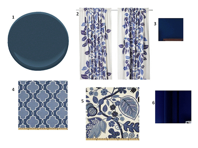
There's a window in the back door, and a window over the sink.  I'm considering these  paints and fabrics:

1. Benjamin Moore's Gentleman's Gray.  I originally considered this color for my antique secretary makeover, but it was too navy.  Which is perfect for the kitchen.  This navy has a bit of a green undertone.

2. The Ikea Stockholm Blad curtain.  I love these curtains; we have the green version in the playroom.

3.  Ralph Lauren Adirondack Blue.   You can see it in a room here.

4. This quatrefoil fabric is PKaufmann's Luca in the Sapphire colorway. I have a yard of this in the Teal colorway that I was going to recover my office chairs in, but since we are moving and my office will now be in the attic, I am holding off for a while. The scale of the fabric is pretty large, though, and the windows are small.  

5. PKaufmann's Chloe in the Sapphire colorway.

6. Ralph Lauren Club Navy.  In the two little paint clips above it looks pretty similar to the Adirondack blue (and they are very similar), but I'd say that the Club Navy is more royal blue-ish, and the Adirondack blue has more of a deeper, blacker undertone. 

Friday, May 13, 2011

in search of Mennonite underwear

If you are not interested in the undergarments of a modest woman, you can just skip right along to the next blog.

I started wearing pettipants about fifteen years ago, around the time I stopped wearing teenage hoochie clothing and started wearing skirts that hit my knees.  Pettipants are like a slip, but they are shorts.  They act as another layer under skirts, and keep your thighs from chafing together. If you are skinny enough that your thighs don't touch, well, goody for you.  For the rest of us, these slips are fantastic. I love them, especially in the summer, because they are light and airy and keep me from getting sweaty.

They look like this:


Notice that they are NOT form-fitting.  They are not the "shapers" sold by most undergarment stores.  I detest those Spanx-type items that are designed to give you a smoother, slimmer shape---they make me feel like a 10 lb sausage stuffed into a 5 lb casing. If I have to yank and tug an article of clothing to get it on or off and it shoots to my ankles like a rubberband, its not going to be in my daily rotation.

When I was pregnant with the Princess, I bought some pettipants in an XL, but they just didn't fit right over the bump.  My mother took my regular size medium pettipants and snipped the elastic in the sides.  As I got bigger, I kept snipping the elastic.  That worked fine. 

Princess is now two years old and I am finally back down to my pre-pregnancy weight, and the XLs are far too big on me.  Out of desperation I have been wearing the old size mediums that I snipped, but obviously, those have logistical problems.  

These pettipant slips aren't easy to find, but usually, if you go to a Maidenform outlet store, or a department store frequented by old ladies, you can find them.

Until now.

Over the past few weeks, I have been to every purveyor of underwear in Bergen County and beyond, and NO ONE has them.  Furthermore, most employees working in the underwear department don't even have a clue what I'm talking about.  If they do sell slips, they have ONE model.  One.  There are rows upon rows of sausage casing shapers, but a plain old slip?  Just one.  Pettipants?  Don't exist.

Turning to the google, searches for pettipants or culotte slips bring up products in two general camps:  "exotic" lingerie or Mennonite wear.   This is a family blog, so I'll skip the pictures of the exotic lingerie products.

Under Mennonite wear, there are descriptions like "the perfect finishing touch for your Victorian outfit!"

The "also sold with" category on Amazon for the one above includes a shephard's staff. Which might be helpful in corralling my kids, although a whip and a chair would probably be more useful.

I found a website called ModestClothes.com, which has many categories, one of which is "old fashioned goodies" such as muumuus, caftans, dickies and culotte slips.  Aha, now we are getting somewhere. There are four companies that sell culotte slips, most of them catering to women who are over the age of 75.  Also, all of the culotte slips sold by these companies are longer than 24 inches, so they are designed to be worn by Laura Ingalls under a prairie skirt.  (It did say "old fashioned goodies.")

I stopped at the Bali's outlet in the Jersey Gardens Mall, which is where I have bought my pettipants for the last ten years, and it was there that a salesperson told me they no longer sell ANY slips at all, because they have been discontinued.  Apparently women in American no longer wear slips under dresses anymore.

I feel like this a sign, much like the four horsemen of the apocalypse, and what the hell are these youngsters coming to these days?  The world is going to hell in a handbasket.  But the saleswoman pointed me towards the Vanity Fair store, and lo and behold, in the veryyyyyyyy back corner of the store, on a bottom rack, hiding behind some sausage casing shapers, were my pettipants.  None in the 18 inch length, but I bought 8 pairs in the 20 and 24 length, figuring I could cut them down to size if need be.

Victory is mine! I will postpone that trip to the Amish country.